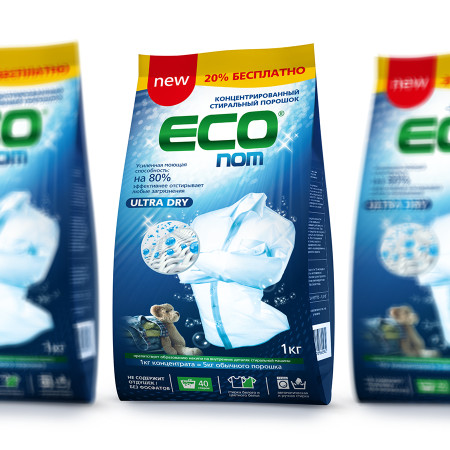
Package design for ‘Vita Brown’ chicory Branding and package design for carob drink ‘Lena McCoder’ branding agency developed the VITA BROWN brand from scratch. We had a task to develop a brand for healthy products of European quality for busy people who care for their health.
That was how brand got the unusual name of Vita Brown. This name looks like a name and a surname, is easy to remember and pronounce and combines ‘vita’ meaning ‘life’ and the colour of primary company products being chicory, carob and coffee. The font is easy to read and hairline reminds of rose thorns which make it exquisite and special.
The primary colour used in the design is bright green, the colour of wet grass. It was chosen with regard to the ecological ideas of the company. This style is emphasized by the wooden background. Icons reflect major characteristics of the product, thus making customers pay attention to the package and choose.
The agency developed several design options, and the client had an opportunity to test each of them on quite a big number of potential consumers and choose the one they liked most of all, which granted sales in the future. At the same time the creative department introduced their advice and recommendations that affected the Client’s decision.
This project is an example of concerted efforts of marketing experts, designers and the Client: all decisions were made fast and clearly, meetings were efficient both in the office and in informal surroundings, and the whole process was positive and inspiring. We take pride in sales within federal networks, good product reviews and increasing demand for VITA BROWN products.